Sundays with Ydp: Should you put bold fabrics on your sofa?
So designing spaces is always about my clients. They don’t want MY designs, they want THEIR designs brought to life.
The problem is sometimes all fabrics do not look good on ALL things.
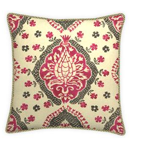
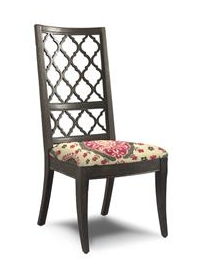
Take this fabric for example….It’s lovely right?
 It’s a large scale print with a nice color combination of lipstick pink, black and cream.
So if it’s this lovely and a client likes it, we should use it right? Absolutely, especially if it resonates beautifully in their space.
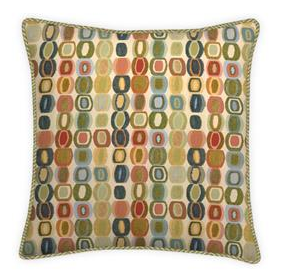
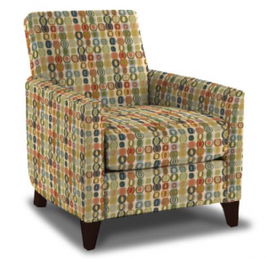
How about this fabric?

It looks like a fun geometric print that could add an element of fun and whimsy to a casual room; but how should we incorporate it into a design plan?
Lets take a look
Sofa #1

Sofa #2

What do you think? Do you love them or hate them? Here are a few questions you might ask yourself before choosing a fabric for your sofa.
- Is this too much or just right?
- How will I decorate around it?
- Will I get tired of this over time?
- Will it offer design flexibility or limitations?
- What room(s) will it look good in?
- What type of area rug should I you use with it?
- What style curtains will go with it?
- How flexible is the color palette, if I decide to make changes?
- Will this look dated in 12 months?
- How will it relate to other elements in the room?
Even though we may fall completely in love with a beautiful fabric….and there are many! It’s important to know how to best use your selections.
In an effort to incorporate client favs in the design plan….Here’s how I would recommend using the bold prints instead.
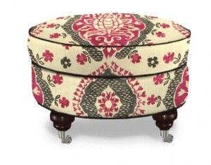
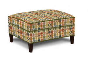
Ottomans, pillows and even chairs would be a great choice for the following reasons:
- They are easier on the eye
- Less expensive to change/update
- A great way to add “flava” without being overwhelming
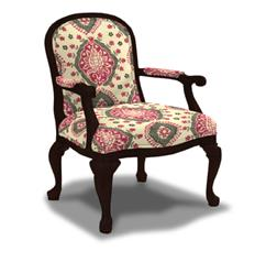
I would even consider the patterns on chairs
Here’s an example of how they can enhance a room without overwhelming it. And the beauty is, when you’re ready for a change, swop out the pillows, transfer the ottoman to another room or simply update it with a new fabric….Ez Peazy 🙂

Some of you might be saying, but I like the dramatic sofa! Well that’s okay. If you like it, here are a few ways to rock it.
- Make it an intentional focal point in a room where other items won’t compete with it.
- Try it in a boutique design that could drive traffic in your store.
- Or If you’re designing an area in your home that has a special niche or theme …go for it a make it unique.
Design Tip of the Week
Keep large furniture pieces like sofas and sectionals on the neutral side for the most design flexibility.
What would you do? Go for the dramatic sofa or use bold prints in smaller ways? What was your first impression when you saw the sofas?
Thanks for stopping by!
Have you seen our video?
We help busy career families create comfortable stylish homes
For inquiries, reach out to us via email at rjackson@yourdesignpartner.com or call 217 722-4806
Inspiring Creativity,
Ricci

Decorating or Refreshing Your Home?
Download our COMPLIMENTARY checklist and get access to our 7 Step Process to Decorate in Stages, Stay on Budget & Reduce Overwhelm.
Thank you for requesting our checklist head over to your email to get instructions on how to access it now!
We hate spam as much as you do we promise not to share any of your information...



I don’t think I would do the bold sofa, although I love the idea for driving traffic to a boutique. I would stick with the neutral sofa. Great post!
Thank you Susie!