Our latest project: A New home gets a touch of blue, gold and violet
Our latest project is a perfect example of why decorating in stages is a good rule of thumb.
Ultimately, when planning over several months, it affords you the opportunity to spread the budget out, creating less stress and financial burden.
It also gives you time to get acquainted with the space if you’ve just purchased a new home.
This project was spread out over 6 months and in two stages. We began in March and completed the space in September.
Our clients had just purchased a new home and were excited to add their personality to the space.
They weren’t fans of clutter and tchotchkes, but wanted a space that felt modern yet cozy.
We kept a neutral palette throughout the home for paint, but added punctuations using wallpaper and deeper tones of paint in strategic places.
Since they were attracted to purple and blue, we made sure these hues were represented in the home.
Here’s a look at the process along with before and after pics
Phase 1
- Paint first floor
- Order and place new furniture
- Replace light fixtures and ceiling fans in several rooms
- Add wallpaper to the master suite
- Add custom window treatments to the hearth room, master suite and living room
Phase 2
- Add draperis, cornice boards and valances in two additional rooms.
- Source area rugs, table lamps, wall art and accessories to bring the overall aesthetic and home vibe together
- Add final seasonings to each area
- Before and after master suite
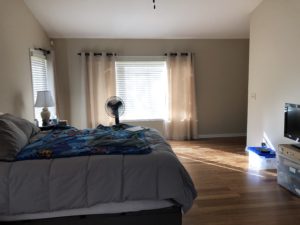
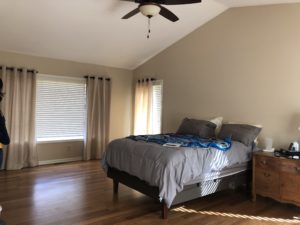
Before and after master bedroom
Before master bedroom
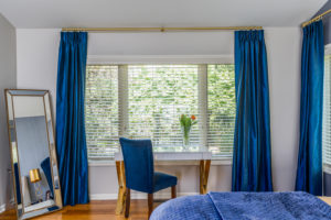
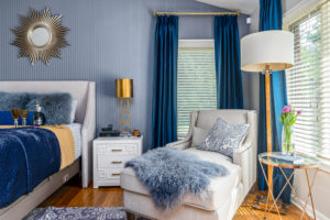
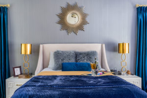
After Master bedroom
Mood: Regal and cozy
Hues of deep blues, violets and golds are an inviting palette. We added a custom upholstered headboard to allow for easy movement of an adjustable mattress.
Our textured wallpaper, area rug, draperies and gold accents enhanced the room with a relaxed yet regal elegance.
Before and after Living room
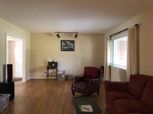
Before living room
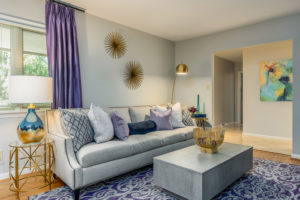
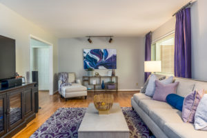
After living room
Mood: modern, and cozy
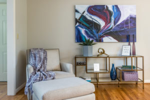
This neutral space was punctuated with tones of purple, violet, gold and a touch of blue. All furniture and accents were new selections and created a modern yet cozy vibe. The large wall art captivates your attention when entering the room.
Before and after Dining room
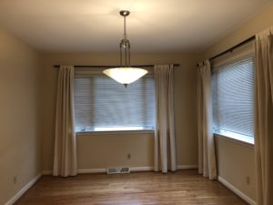
Before Dining room
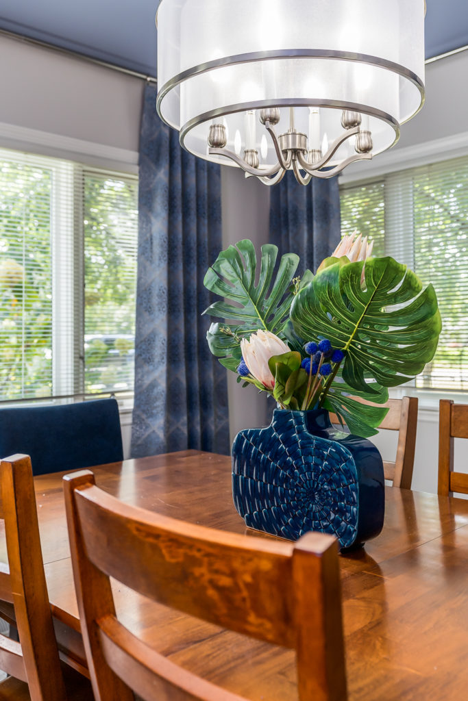
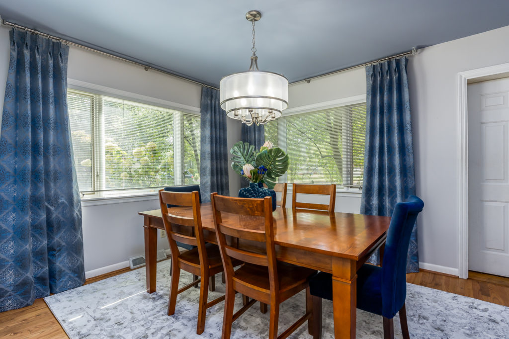
After Dining room
Mood: unpretentious yet elegant
We painted the ceiling to add character and interest, updated the chandelier and installed custom draperies to enhance the client’s existing dining room set. A new area rug, host and hostess chairs and centrepiece enhanced the overall look.
Before and after Hearth room
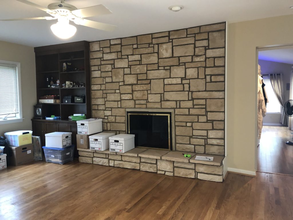
Before Hearth room
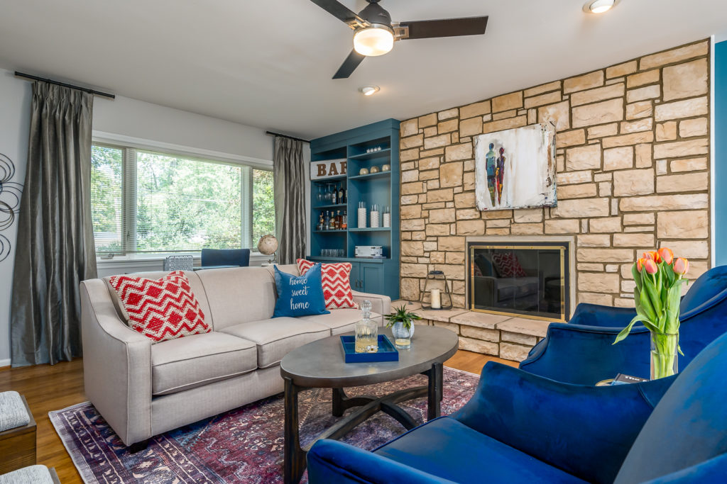
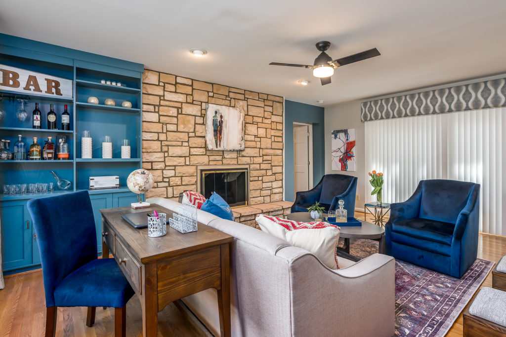
After Hearth room
Mood: Conversational and comfortable
We painted the bookshelf and gave it a new identity. This multipurpose space will function as a place to catch up on work using the console/desk behind the sofa, relax with drinks in front of the fireplace and converse with family and friends. The sliding glass doors (with the cornice board) opens up to patio seating with an opportunity for chilling and grilling.
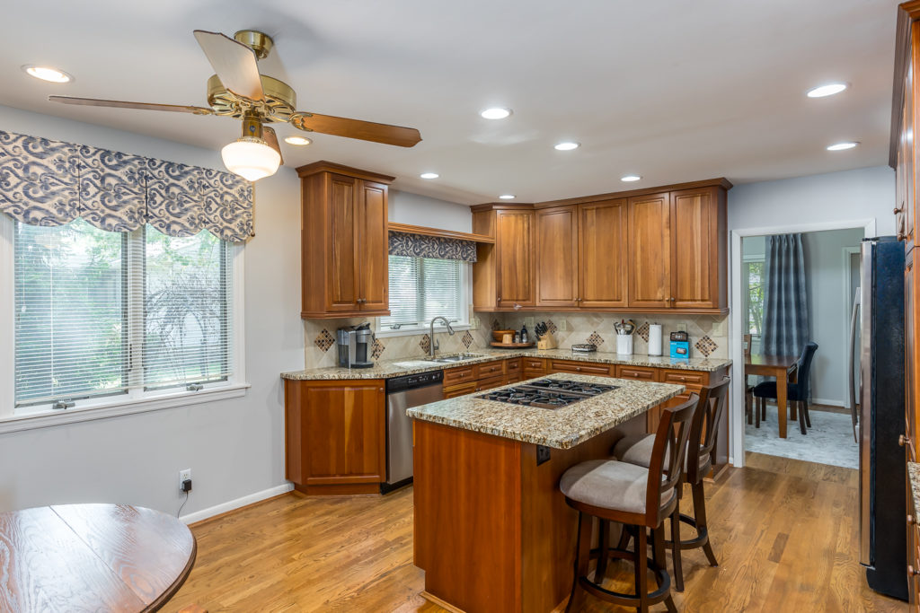
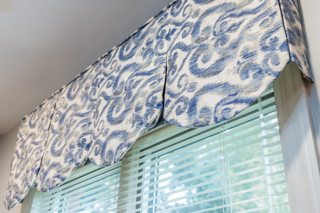
Before and after kitchen window treatments
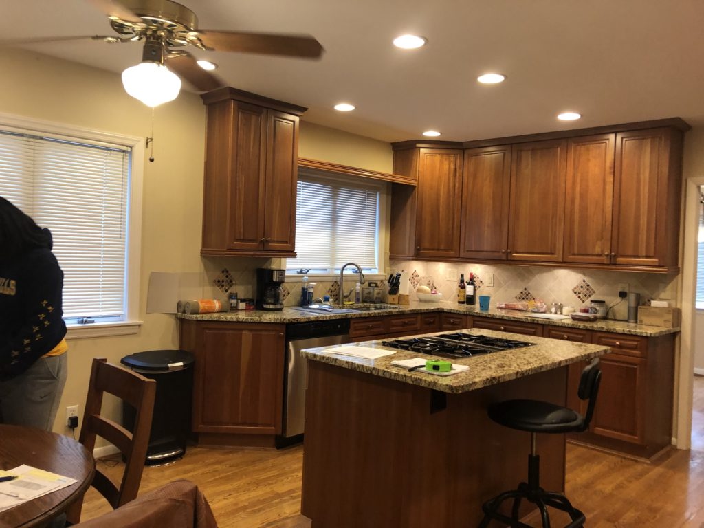
Before Kitchen windows
After Kitchen windows
We added two custom top treatments in the kitchen to frame the windows. Once valance and one cornice board.
My favorite part about helping our clients was their involvement. They were committed to the process, and were awesome to work with. And of course I loved that they embrace color.
As a collaborative interior design firm, we help busy homeowners create a home they feel proud of. We aim to design spaces that evoke emotion and make you smile. Can we help you bring visual clarity and a focused plan of action to your next project? Contact us to see if we’re a good fit or learn about our process . You can also email us at rjackson@yourdesignpartner.com or give us a ring at (513)-409-3759
Your partner in design
Ricci

Decorating or Refreshing Your Home?
Download our COMPLIMENTARY checklist and get access to our 7 Step Process to Decorate in Stages, Stay on Budget & Reduce Overwhelm.
Thank you for requesting our checklist head over to your email to get instructions on how to access it now!
We hate spam as much as you do we promise not to share any of your information...


