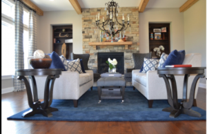
Most of us need to see it before we buy it
We are visual people and often have a difficult time imagining how an idea might look in our head. We literally think and process ideas in images, so If I told you that I just ate a juicy triple decker burger with white cheese, tomatoes, jalepenos and pickles, you would likely be imagining just what it looked like. Am I right? Lol. Well knowing this is precisely why I have an empathetic appreciation for the client who says, “I just can’t envision it Ricci”.
I recently found a new platform that helps me layer product recommendations right onto client images. clients get to see how certain recommendations might look in their actual space. Sure I still use 3D renderings, but this 2D concept has become an efficient way to save time and when I save myself time, my clients save money. I call that a win win win. 🙂
I start with photos of the rooms. I often take pics of each wall from different angles, trying to get the shots as straight as possible.
The entertainment space
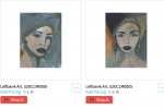
This particular image (above) is slated for a vibrant entertainment space with a cultural vibe. It will have a flat screen tv above the fireplace mantel with art in the niches. While explaining this concept and using images of the items is great, they don’t always help one understand the big picture.
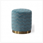
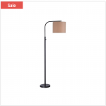
I am proposing that the elements (above) will be perfect for a lounge-y entertainment space. The room will provide extra seating (ottomans), a place to put beverages and snacks (console table) and the floor lamp will provide additional lighting. I want the art in the niches to set the mood for the room, so they have to be large and captivating. Oh and have a cultural vibe.
After creating this concept using the client’s actual room, they can now easily understand the vision for it.
The great room
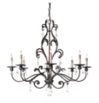
This great room needs a light fixture; so using the same idea, I took a photo of the room and selected a few styles to show how they might read in the space.
I’m recommending that we add a little bling as a juxtaposition to the heavy stone and dark wood tones in this great room and since the adjoining rooms have an oil rubbed finish, I’m recommending that we maintain consistency for harmony.
Making things easier is always on our agenda and so far this has been great for local and distant design consults.
My favorite thing about the platform is that it provides a convenient way to click an item for pricing, so clients can purchase the things they approve and fall in love with. All recommended items are within any pre determined style/budget set from the initial consultation. So whether I take the photo or my clients provide them, professional guidance is more accessible.
Do you need to see how a room might look before you make a purchase? Don’t worry most of us do ???
Thanks for stopping by friends. We partner with busy homeowners to create spaces that feel authentic to their lifestyle and we blog about subjects that educate and inspire. Contact us to learn more about our products and services. You can email us at rjackson@yourdesignpartner.com or
call 513-409-3759
Inspiring creativity,
Ricci

Decorating or Refreshing Your Home?
Download our COMPLIMENTARY checklist and get access to our 7 Step Process to Decorate in Stages, Stay on Budget & Reduce Overwhelm.
Thank you for requesting our checklist head over to your email to get instructions on how to access it now!
We hate spam as much as you do we promise not to share any of your information...


